


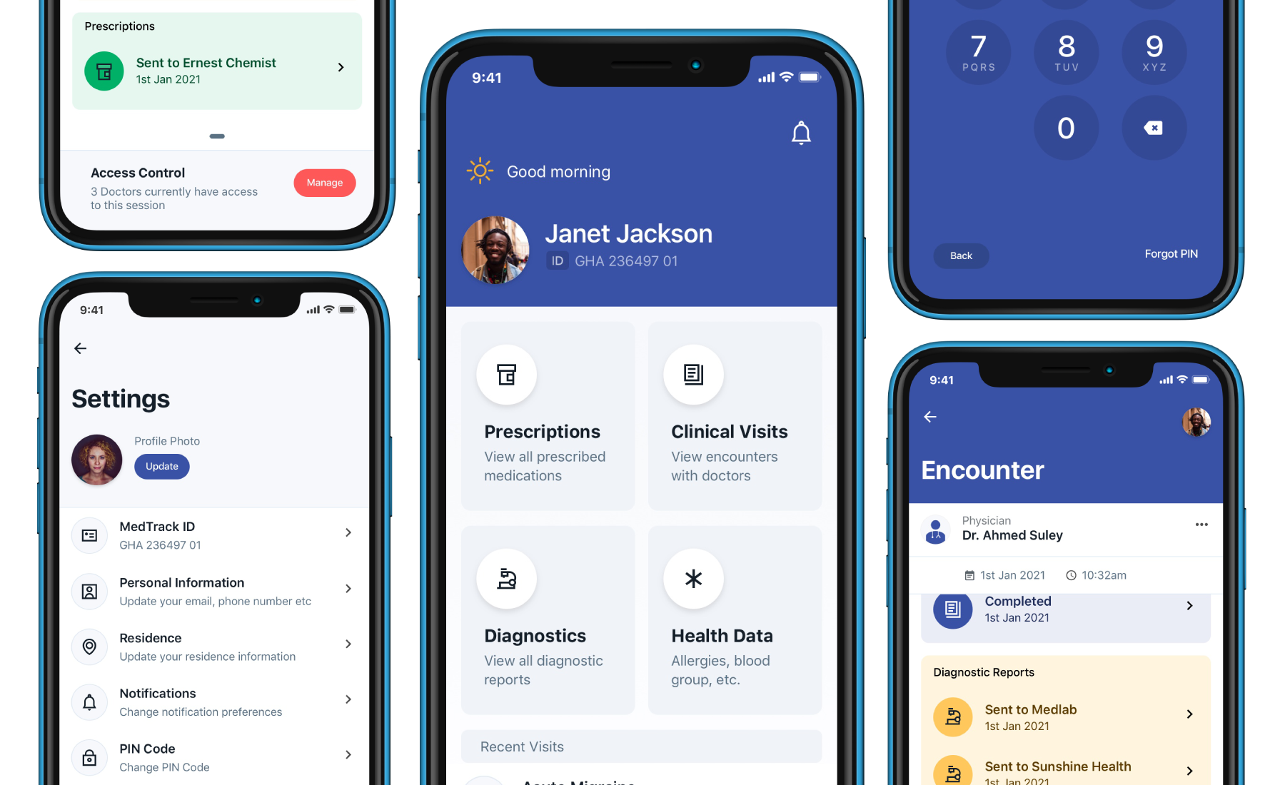
We believe patient health records should be easily trackable, safely transferable, progressive and secure. The mission is to build a universally accessible and portable health record system for Africa's 1 billion plus citizens.
For reach in under represented and unconnected citizens, we are driving scale by connecting citizens’ health data to already established national digital ID systems.
We have successfully empowered doctors to provide a seamless patient experience using our web app service and now needed to provide a way for patients to become custodians of the health data generated. This set us out to build a mobile wallet-type app that will help users track their health information regardless of their primary facility, physician or location.
Thus my journey began.
In drafting a plan to build a decentralized health information system that travels with the user, I had to spend time discussing the possibilities and barriers with service providers such as community doctors, lab technicians, pharmacists and most importantly, patients on defining the major needs, complimentary use cases and nice-to-have.
In Africa, caregiving is hindered by communication blocks between patients and physicians. Siloed patient medical information and the general lack of patient involvement through out the caregiving experience is also a major contributor to this problem.
MedTrack allows facilities to capture a comprehensive picture of patient health information, medical history and other clinical data. Here, I set out to design a solution that empowers patients to take control and have oversight over the captured data.


Create what will eventually become a mobile health wallet for Africa’s 1 billion citizens. A solution that will augment patient interaction with their physicians and other point of care services. The goal is to connect the three key data point areas under consideration.
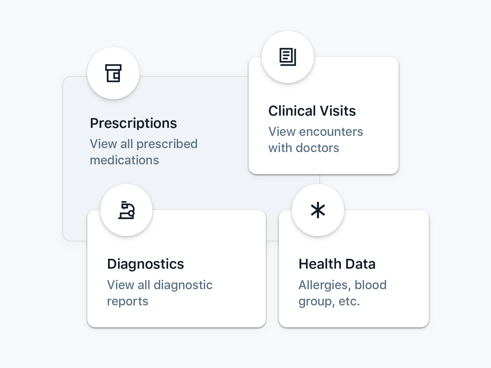
Across Africa, the majority of healthcare encounters revolve around three vital data points: diagnosis, prescriptions, and diagnostics. These key elements heavily shape and influence the course of medical care.
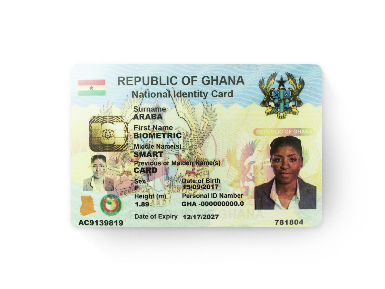
Designing a solution to seamlessly integrate health information records with national identification systems, to transform these ID Cards into a physical MedTrack app experience
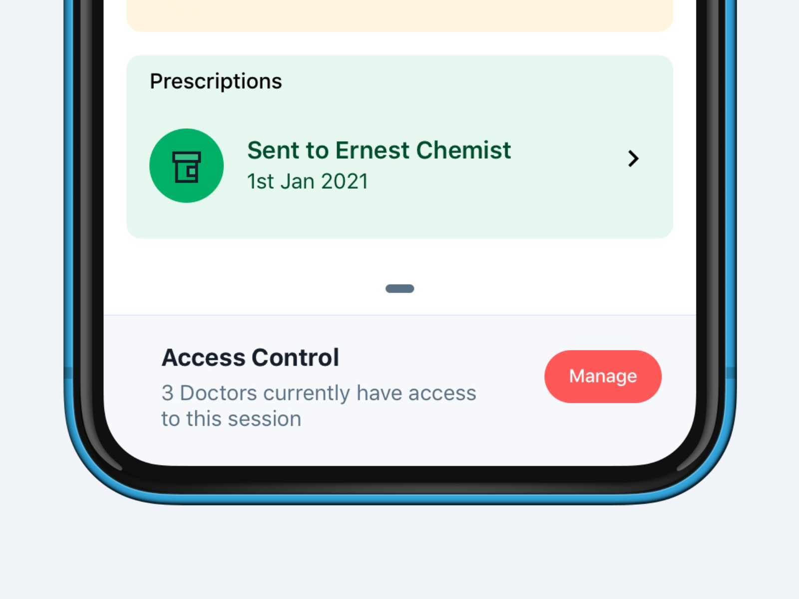
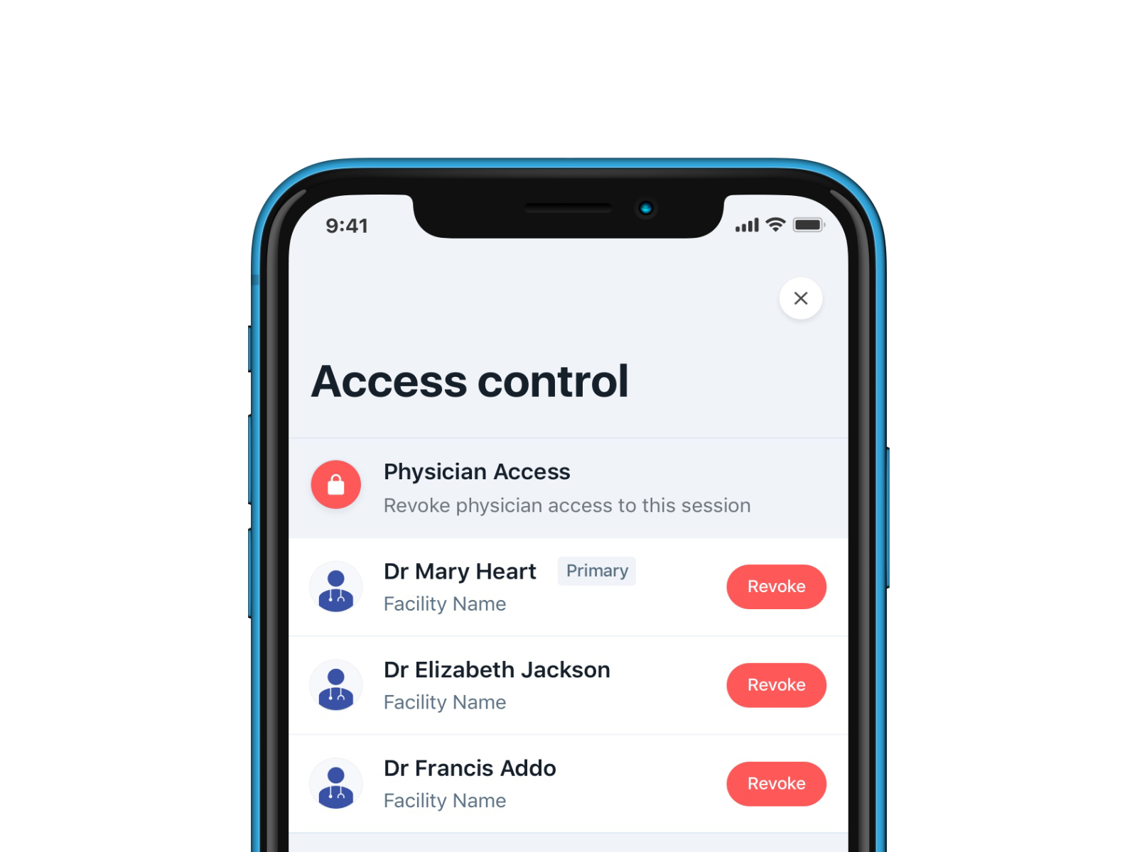
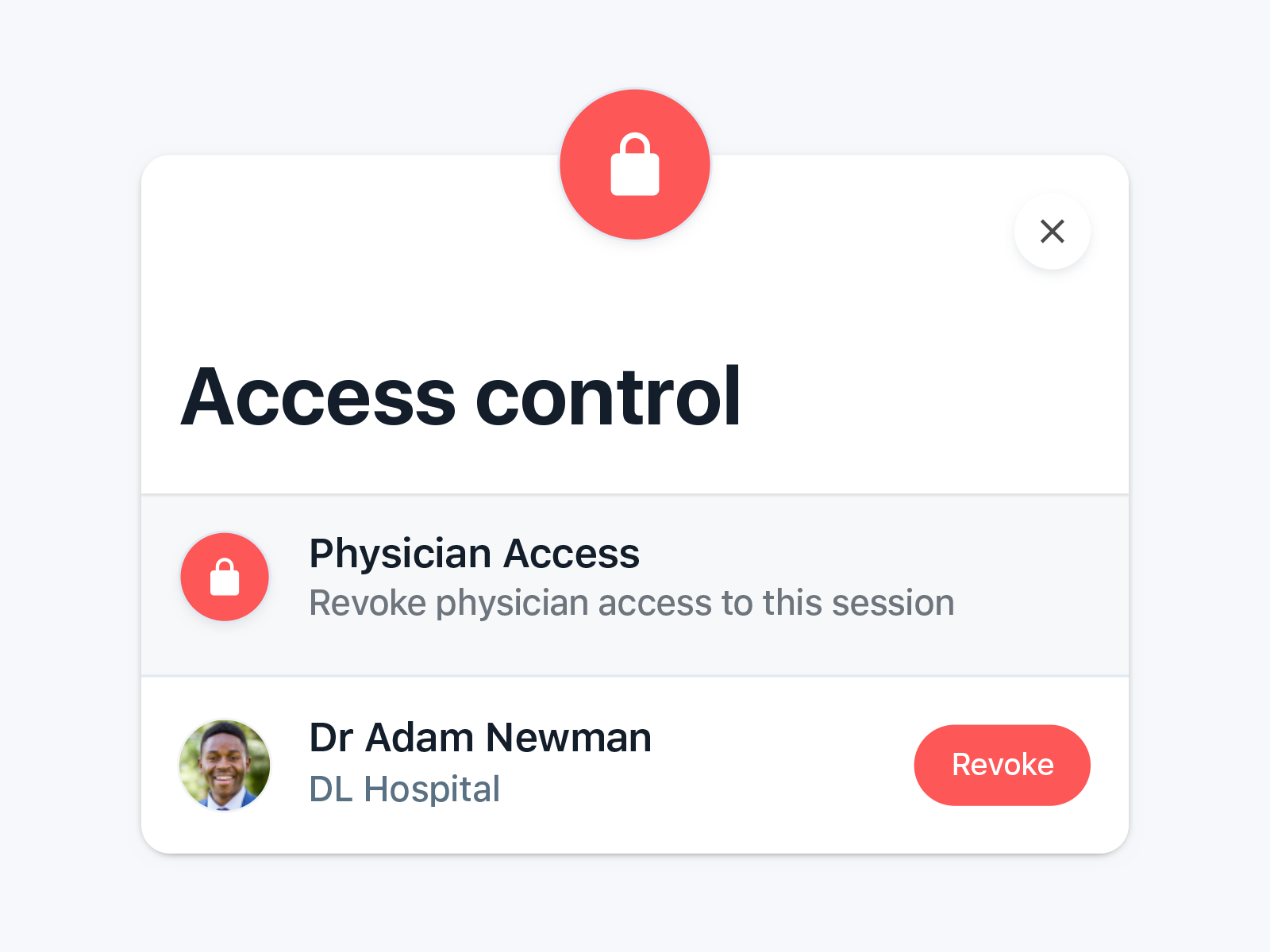
Due to MedTrack's patient-centered approach, a solution designed around giving users an overview of physicians access to their medical data is a key requirement. Here, users can control and manage access.
Most users will use the app as a point of reference when discussing medical history with doctors or other caregivers.
Glanceability was a key factor in determining certain design queues and choices. Using average day phrases and queues was also an important component to improve information assimilation.
There are three key success points; mapping medical information to a particular encounter date and time, proper tracking of medication dispensation and diagnostic report and lastly, securely sharing access to this information with physicians who may not be your primary caregiver.
Physicians and facilities are already generating patient data using the MedTracks web app. These data are centered around patient's prescription history, diagnostic reports (lap and imaging data) and clinical visits. The goal here is to provide a way for patients to become custodians of the health data that is being generated.
Originally not included was the Health Data section, which was later planned to serve as an engagement gateway for first time users. Here, the system could serve users with curated content based on the data they share. Tips on chronic disease management and other health tips can be good strategy to engage these groups.
Slight variations were made to the main brand palette due to the high mobile pixel density. The three primary colour were largely maintained as is.
Keeping typography consistent and sticking to logical hierarchies ensures that elements in the UI are clear and easily recognizable when scanning the screens. OS under consideration here is iOS and thus the preference for SF UI Text.
A spacing system is to support visual consistency in page layouts. Using a spacing unit of 8px as the base value and setting that ratio to 1 allowed me to create a consisted spacing rhythm. This is particularly important to maintain that visual consistency.
Maximizing label comprehension reduces cognitive load with the effective use of iconography. Here, I explored two icon styles. A rounded-edge style to reflect a friendly approach but ultimately settled on a more formal, sharp-edge approach as it fit the overall theme better.


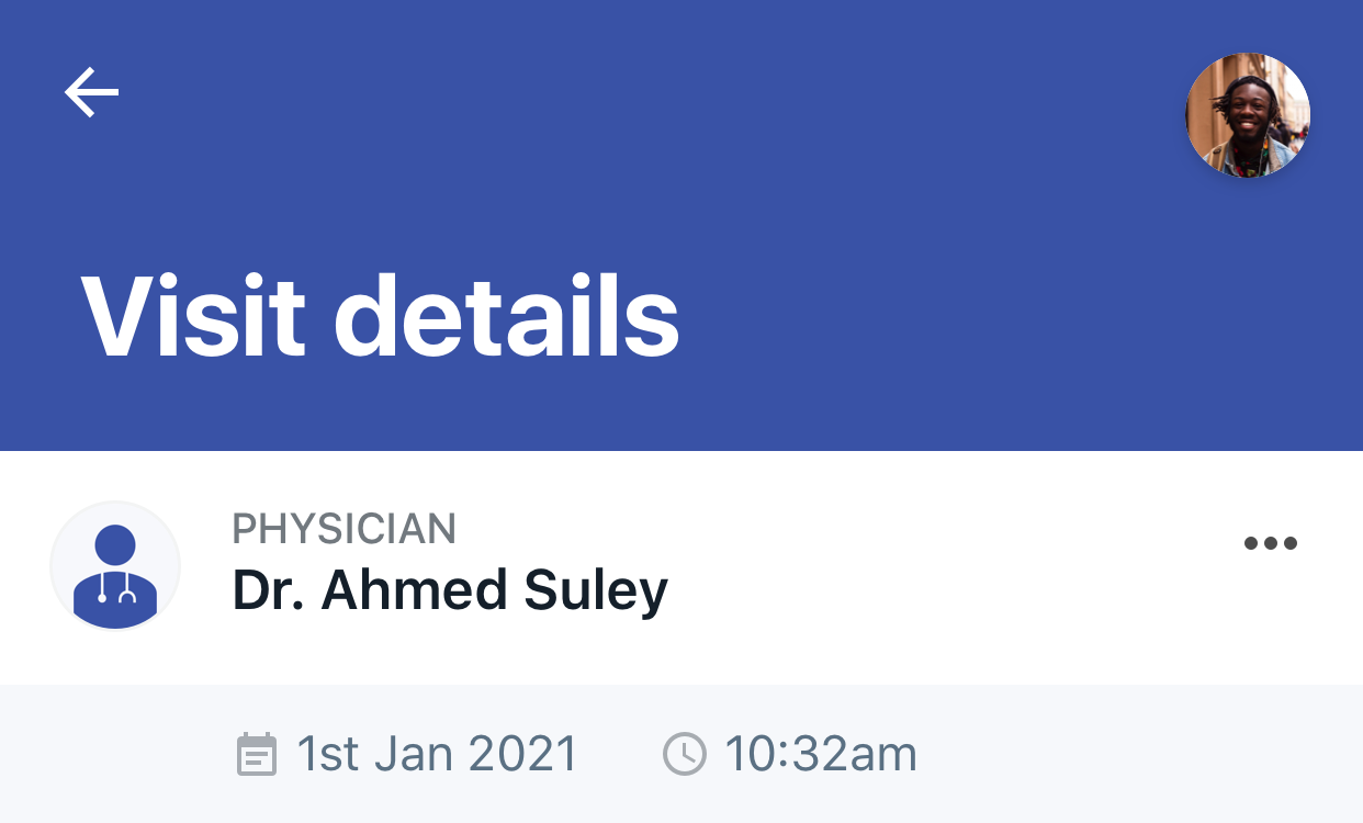
When a user grants access to a physician's request, an in-app prompt with a subtle animation is employed to reaffirm the user's action.
Utilizing a red hue as a visual guide was a clever way to connect the lock icon with the action of or locking out or revoking physician's access.
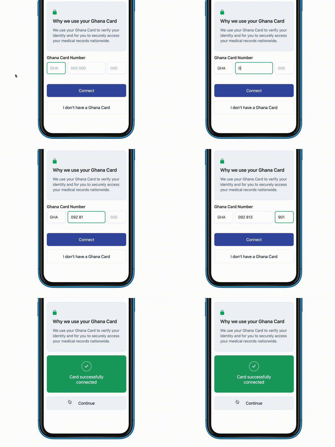
Broke the input fields down into blocks to match the Ghana Card numbering sequence and spacing - GHA 000 000 00 . The design decision here is to visually aid data entry and improve user experience with an added benefit of reducing entry errors.
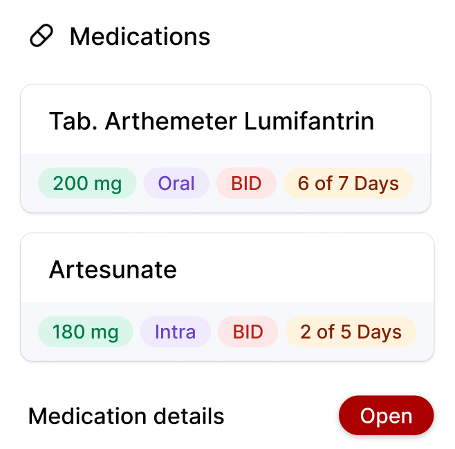
Labels and dosage information were among the most frequently discussed points of interest during my time with patients and physicians. Being able to clearly convey information here was a major point of focus.
Here, I designed elements to prioritise clear labelling for dosage information and the encounter point they were generated.


Visiting the 600-bed-capacity Ridge Hospital was a great source of inspiration for this design choice. The facility's colour-coded wards aid patient and staff navigate the the large multi-floor structure. I took inspiration to implemented a similar approach in the app.
By mirroring this concept, the aim was to enhance user experience by building muscle memory and minimizing navigation guesswork.


Below is how this idea translated into design.
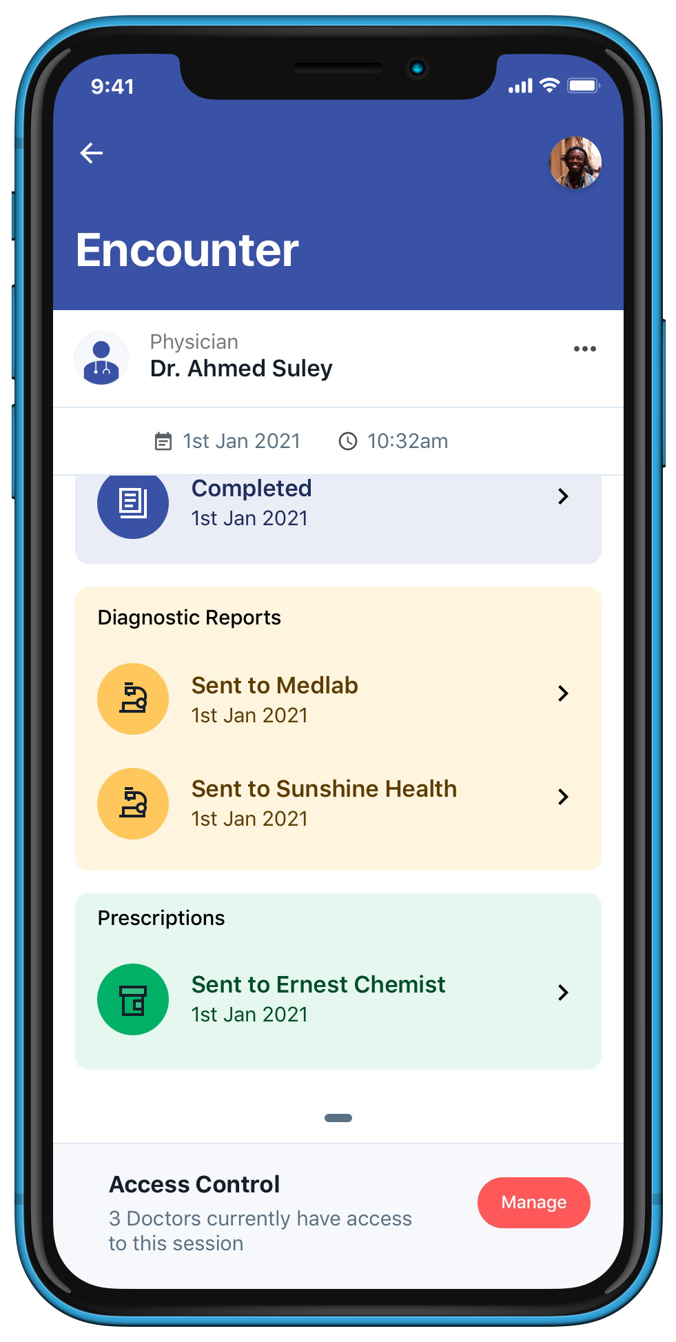
Conclusively, these came together pretty well. A clear, well-labelled visual interface experience with an excellent information hierarchy and a strong visual brand. Subtle visual animations improved user experience.
It was such an honour to be part of this project. Working on products that have direct effect on millions of lives are always a welcome challenge. Brainstorming through some of the solutions we came up with as a team was a great way to learn and contribute.
As a team, we quickly learnt that, our solution needed to present data in its simplest format. Removing all data distractions and only show relevant information to the user was a key requirement we weren't open to compromise on.
In terms of decisions I would have made differently, one area I'll definitely take a look at is our initial onboarding flow where we collect patient's health data such as allergies, blood groups and pre-existing conditions. A solution that makes sharing this information feel more natural would be a great one to explore. Hopefully I can do this for our next updates.